Branding Spotlight: Glucose Glow Up
April 15, 2024
Introduction:
At Mazza Marketing Co, my mission is to create brands that make a difference. The Glucose Glow Up project presented a unique opportunity to leverage my expertise in design and branding to support education within a topic that causes a lot of confusion; blood sugar management.
The Concept Behind Glucose Glow Up Branding:
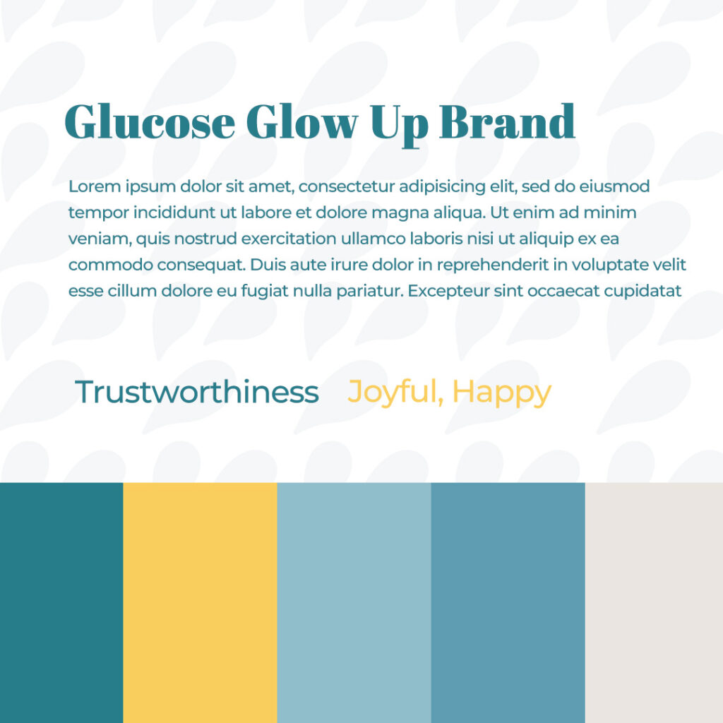
The branding strategy for Glucose Glow Up was rooted in research and my creative vision for how I want people to feel when interacting with the blog. Teal, chosen for its feeling of trustworthiness, served as the cornerstone of our visual identity, instilling confidence in the project’s credibility. Meanwhile, yellow, symbolizing joy and happiness, infused the brand with a sense of optimism and vitality, reflecting the transformative journey towards better health and increased energy.
The name Glucose Glow Up came from my “glow up” when I figured out a system to balance my blood sugar and lowered my fasting glucose and in return gain more energy. It felt like a fitting name for such a transformation that happened inside as well as outside. To create more visual variety, I added the blood droplets that symbolize needed to track your glucose with a glucometer forming a flower like element.


My Personal Journey:
Drawing inspiration from my personal journey with blood sugar management, I wanted to create a brand narrative that resonated with empowerment and education for those wanting to take charge of their health.
How Glucose Glow Up Works:
- Glucose Glow Up currently features tools and strategies to balance your blood sugar, signs you may have dysregulated blood sugar and resources I’ve used to achieve optimal levels.
- Coaching and training on blood sugar management & insulin resistance
Follow Glucose Glow Up:
Facebook: https://www.facebook.com/glucoseglowup
Instagram: https://www.instagram.com/glucoseglowup/
Add a comment
0 Comments